Implementing a light and dark theme with persistence using React

Introduction
So, you’ve come to that point in the creation of your website where you want to do something that looks “cool”, and what’s cooler (or more on brand with 2020) than having a button that allows users to flip the theme of your site from light to dark (and back again). You’ve undoubtedly noticed the increasing number of websites out there that offer this functionality, but how easy is it to implement? I’ll tell you: relatively easy. As long as you know a little React and some CSS, this is going to be a (socially distanced) walk in the park.
All of the code for this tutorial is available here.
An example of this project can be viewed here.
The goal
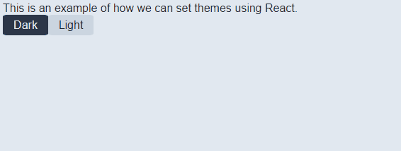
To have a simple switch or set of buttons that users can press to change the website from a light theme to a dark theme (or theme 1 to theme 2), and back again. The user selection must also be remembered for the next time they visit the site. Here is an example of the proposed solution:
The solution
Prerequisites:
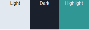
You can either set up your React solution yourself, use an existing solution, or clone the following git repository: https://github.com/mojiwa/react-light-dark-theme.git For this example I’m using standard React with plain CSS. Node version is 14.10.1 which you can download here . If you are cloning the above repository, you’ll need to run npm install to get all the packages installed. Colour selection: Before we begin it’s important to think carefully about the colours you use for both light and dark. I’m not going to go into a whole lesson on the science of colour picking, but what I tend to do is pick two colours that work well when you invert them (e.g. a light colour for the background and a dark colour for the text that are swapped around when the theme is switched); and a highlight colour for links, underlines, buttons etc. that works well with either background/font colour. Finding these colours might take you a little while but it’s worth taking the time out to do this. For this article I’ll use the same colours I’ve chosen for my personal site as they work quite nicely together:
Light: https://www.colorhexa.com/e2e8f0
Dark: https://www.colorhexa.com/1a202c
Highlight: https://www.colorhexa.com/319795
Getting started:
I’m going to be working in App.js and I’ll start by defining all my colours as constants so that I can refer to them easily in the code:
const THEME_LIGHT_HEX = '#E2E8F0'
const THEME_DARK_HEX = '#1A202C';
const THEME_HIGHLIGHT_HEX = '#319795';
I’m going to also create an Enum to store the two themes so that I can execute a simple if/else statement on them when setting the theme later on. With that in mind, the skeleton outline for App.js now looks like this:
import React from 'react';
const THEME_LIGHT_HEX = '#E2E8F0'
const THEME_DARK_HEX = '#1A202C';
const THEME_HIGHLIGHT_HEX = '#319795';
const THEMES = {
Light: THEME_LIGHT_HEX,
Dark: THEME_DARK_HEX
};
function App() {
return (
<div>
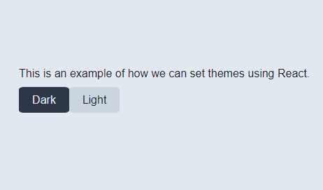
This is an example of how we can set themes using React.
</div>
);
}
export default App;
That’s enough to get us started. Ensure that you tell your index.js file to render into your html entry point (whether that’s ‘root’ or something else).
Creating the switch:
There are a lot of ways to toggle themes on a site. You could use a button, a checkbox or a toggle switch. It doesn’t matter what you use as any of them will work and the JavaScript code is going to be the same. It’s all down to personal preference at this point. I’m going to create two buttons, one to switch to light and one to switch to dark. We’re going to get into some CSS now to style the buttons (which will actually be styled divs as opposed to HTML buttons). I have an index.css file that is imported into App.js. That’s where I’ll be creating my buttons. Again, there are a lot of ways to do this but I’m opting for the simplest way that doesn’t involve additional tooling/frameworks. Use whatever method you feel comfortable with for creating styled elements:
.button-holder {
 display: flex;
}
.theme-button-light {
 height: 25px;
 width: 60px;
 border-radius: 10%;
 padding: 2px;
 display: flex;
 align-items: center;
 justify-content: center;
 cursor: pointer;
 background-color: #cbd5e0;
 color: #1a202c;
}
.theme-button-dark {
 height: 25px;
 width: 60px;
 border-radius: 10%;
 padding: 2px;
 display: flex;
 align-items: center;
 justify-content: center;
 cursor: pointer;
 background-color: #2d3748;
 color: #e2e8f0;
}
.theme-button-light:hover {
 background-color: #e2e8f0;
}
.theme-button-dark:hover {
 background-color: #1a202c;
}
You can then throw these into your page (don’t forget to import the css into App.js - see the full code output at the bottom of this article if you’re not sure how to do this):
function App() {
 return (
  <div>
   This is an example of how we can set themes using React.
   <div className='button-holder>
    <div className='theme-button-dark'>Dark</div>
    <div className='theme-button-light'>Light</div>
   </div>
  </div>
 );
}
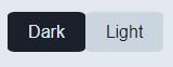
You’ll end up with something that looks like this (note that there is a hover effect on the buttons for some simple user feedback):
Wiring the buttons: The next thing we need to do is wire up the buttons to execute a function when you click them. Edit the two button divs so that they look like this:
<div className='theme-button-dark' onClick={() => applyTheme(THEMES.Dark)}>Dark</div>
<div className='theme-button-light' onClick={() => applyTheme(THEMES.Light)}>Light</div>
You’ll notice that we call the function “applyTheme”, but no such function yet exists, so let’s make that:
function applyTheme(theme) {
}
Setting the theme:
To actually be able to see anything happen we need to set the background and text colours to what we’ve chosen. For the sake of simplicity, I’m going to achieve this by setting the body style of the page through JavaScript code:
function applyTheme(theme) {
 document.body.style.backgroundColor = theme;
 document.body.style.color = theme === THEMES.Dark ? THEMES.Light : THEMES.Dark;
}
All we’re doing above is setting the background colour to the theme passed in. We then set the text colour to the opposite by using an if statement to check whether we passed in the dark theme or the light theme (if you pass in the dark theme, set the text colour to be the light theme and vice versa). Now when you run it you’ll have something that looks like the proposed solution above:
Persistence and defaults:
The last thing left to do is to save the theme so that when the site is loaded again it remembers what was previously selected. We also need to make sure a theme is set the first time the site it loaded (so it’s not just the default white background). We achieve these things using web storage and either “ComponentDidMount” or “UseEffect” (the latter if you’re using React Hooks). This example project uses Hooks so if you’re not familiar with that you can read about it here. Web storage is a cool way to store information for web apps. You can read more about it here. We can use web storage to persist our theme locally so that even if we close the browser and reopen it, our selection will be saved. We also don’t need to worry about security concerns that we do with cookies as no data is ever transferred to the server - it all remains locally stored. The other advantage over cookies is that web storage is far more intuitive to use and it can store a lot more (up to 5MB for session storage, more for local). I’ve created two functions for web storage. One to commit the data, the other to retrieve it. They look like this:
const THEME_KEY = 'THEME';
// Save the chosen theme to web storage
function SaveSettings(value) {
 window.localStorage.setItem(THEME_KEY, value);
}
// Get the saved theme from web storage
function GetSettings() {
// Return the saved theme if a theme has been saved.
// If no theme has been saved, default to the light theme.
 return window.localStorage.getItem(THEME_KEY) ?? THEMES.Light;
}
You can slot this code in just above your App function. To save the theme when we change it we simply need to call “SaveSettings()” with the theme when it’s changed. Update the “applyTheme()” method like so:
function applyTheme(theme) {
 document.body.style.backgroundColor = theme;
 document.body.style.color = theme === THEMES.Dark ? THEMES.Light : THEMES.Dark;
 SaveSettings(theme);
}
To apply the saved settings (or default to the light theme on first load) when you open the page you can either do the below (if you’re using React Hooks), or just call the same function in ComponentDidMount():
// When we load the site, we attempt to get the saved theme from web storage.
useEffect(() => {
 applyTheme(GetSettings());
});
And that’s it. You now have a theme switch that flips between a light and dark theme and saves that to local web storage. The final code should look like this: App.js
import React from 'react';
import './index.css';
const THEME_LIGHT_HEX = '#E2E8F0'
const THEME_DARK_HEX = '#1A202C';
const THEME_HIGHLIGHT_HEX = '#319795';
const THEMES = {
 Light: THEME_LIGHT_HEX,
 Dark: THEME_DARK_HEX
};
const THEME_KEY = 'THEME';
// Save the chosen theme to web storage
function SaveSettings(value) {
 window.localStorage.setItem(THEME_KEY, value);
}
// Get the saved theme from web storage
function GetSettings() {
// Return the saved theme if a theme has been saved.
// If no theme has been saved, default to the light theme.
 return window.localStorage.getItem(THEME_KEY) ?? THEMES.Light;
}
function App() {
 // When we load the site, we attempt to get the saved theme from  web storage.
 useEffect(() => {
  applyTheme(GetSettings());
 });
function applyTheme(theme) {
 document.body.style.backgroundColor = theme;
 document.body.style.color = theme === THEMES.Dark ? THEMES.Light :  THEMES.Dark;
 SaveSettings(theme);
}
return (
  <div>
   This is an example of how we can set themes using React.
   <div className='button-holder>
    <div className='theme-button-dark' onClick={() => applyTheme(THEMES.Dark)}>Dark</div>
    <div className='theme-button-light' onClick={() => applyTheme(THEMES.Light)}>Light</div>
   </div>
  </div>
 );
}
export default App;
index.css
.button-holder {
 display: flex;
}
.theme-button-light {
 height: 25px;
 width: 60px;
 border-radius: 10%;
 padding: 2px;
 display: flex;
 align-items: center;
 justify-content: center;
 cursor: pointer;
 background-color: #cbd5e0;
 color: #1a202c;
}
.theme-button-dark {
 height: 25px;
 width: 60px;
 border-radius: 10%;
 padding: 2px;
 display: flex;
 align-items: center;
 justify-content: center;
 cursor: pointer;
 background-color: #2d3748;
 color: #e2e8f0;
}
.theme-button-light:hover {
 background-color: #e2e8f0;
}
.theme-button-dark:hover {
 background-color: #1a202c;
}